Posted on May 29, 2024 by Admin
Top 30 Best Fonts for Websites in 2024
Choosing the right font for a website can significantly impact its aesthetics and readability. Here is a curated list of the top 30 fonts for websites in 2024, complete with detailed descriptions, key features, pricing, and expert reviews.
1. Roboto
Summary: Roboto is a popular sans-serif font designed for digital interfaces, known for its clean lines and readability.
Key Features:
- Type: Sans-serif
- Styles: 6 weights, including italic
- Price: Free
- Link: Google Fonts
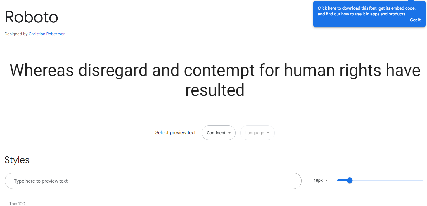
Description: Roboto offers a modern, geometric look, ideal for both body text and headlines. Its balanced, legible design makes it perfect for a variety of applications, from websites to mobile apps.
Expert Review: “Roboto’s versatility and clarity make it a go-to font for web designers looking to enhance user experience across different devices.”
2. Open Sans
Summary: Open Sans is a humanist sans-serif typeface that combines readability with a neutral yet friendly appearance.
Key Features:
- Type: Sans-serif
- Styles: 5 weights, including italic
- Price: Free
- Link: Google Fonts
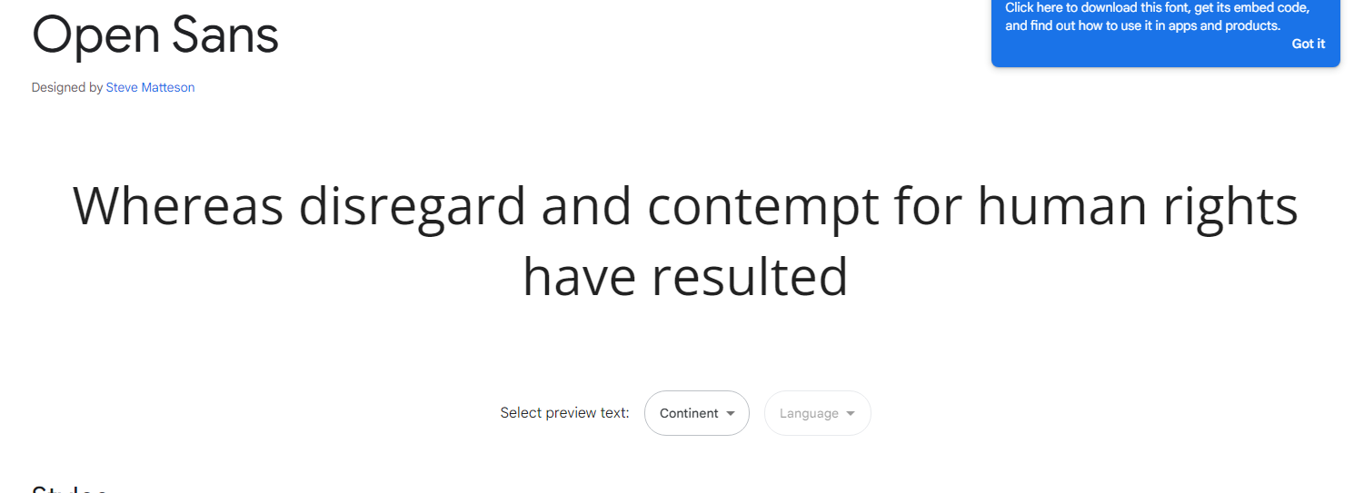
Description: Created by Steve Matteson, Open Sans is optimized for web and mobile interfaces, ensuring excellent legibility at various sizes and resolutions.
Expert Review: “Open Sans stands out for its accessibility and clean design, making it ideal for extensive text content.”
3. Lato
Summary: Lato is a sans-serif font with a strong structure and a touch of warmth, perfect for modern websites.
Key Features:
- Type: Sans-serif
- Styles: 5 weights, including italic
- Price: Free
- Link: Google Fonts
Description: Designed by Łukasz Dziedzic, Lato blends professionalism with a slightly rounded, friendly feel, suitable for both headlines and body text.
Expert Review: “Lato’s combination of professional and friendly design elements makes it versatile for various web applications.”
4. Montserrat
Summary: Montserrat is a modern sans-serif font inspired by the old posters and signs in the Montserrat neighborhood of Buenos Aires.
Key Features:
- Type: Sans-serif
- Styles: 9 weights, including italic
- Price: Free
- Link: Google Fonts
Description: Montserrat features wide, open characters that make it highly readable and visually appealing for both headlines and body text.
Expert Review: “Montserrat’s unique heritage-inspired design adds a touch of history to modern digital spaces.”
5. Playfair Display
Summary: Playfair Display is a serif font with a sophisticated, high-contrast design, ideal for headlines and editorial content.
Key Features:
- Type: Serif
- Styles: 4 weights, including italic
- Price: Free
- Link: Google Fonts
Description: Designed by Claus Eggers Sørensen, Playfair Display offers a classic look reminiscent of the European Enlightenment, perfect for elegant and refined website designs.
Expert Review: “Playfair Display’s elegant style and readability make it perfect for sophisticated web designs and editorial layouts.”
6. Noto Serif
Summary: Noto Serif is a serif typeface designed to achieve visual harmony across multiple languages.
Key Features:
- Type: Serif
- Styles: 4 weights, including italic
- Price: Free
- Link: Google Fonts
Description: Developed by Google, Noto Serif ensures consistent line heights and stroke widths, making it ideal for multilingual websites.
Expert Review: “Noto Serif’s global design focus and clarity make it indispensable for websites with diverse language requirements.”
7. Arvo
Summary: Arvo is a geometric slab-serif typeface known for its versatility and readability.
Key Features:
- Type: Slab-serif
- Styles: 4 weights
- Price: Free
- Link: Google Fonts
Description: With a balance between expressive serifs and geometric structure, Arvo is suitable for both text and display purposes.
Expert Review: “Arvo’s modern yet traditional design elements provide a robust look for any web project.”
8. Lora
Summary: Lora is a serif font with roots in calligraphy, offering a balance between traditional elegance and modern sensibility.
Key Features:
- Type: Serif
- Styles: 4 weights, including italic
- Price: Free
- Link: Google Fonts
Description: Lora’s brushed curves create a sophisticated look that works well for both body text and headers, enhancing the readability of long-form content.
Expert Review: “Lora’s mix of calligraphic elements and modern aesthetics makes it a versatile choice for various design contexts.”
9. Libre Baskerville
Summary: Libre Baskerville is a web-optimized serif font based on the classic Baskerville typeface.
Key Features:
- Type: Serif
- Styles: Regular, italic, bold
- Price: Free
- Link: Google Fonts
Description: Designed for body text, Libre Baskerville enhances readability on screens with its larger x-height and open forms.
Expert Review: “Libre Baskerville is perfect for classic, readable web typography, bringing a touch of historical sophistication to digital text.”
10. Cormorant Garamond
Summary: Cormorant Garamond is a serif font inspired by the works of Claude Garamond, ideal for elegant, high-contrast typography.
Key Features:
- Type: Serif
- Styles: 5 weights, including italic
- Price: Free
- Link: Google Fonts
Description: Its high-contrast strokes and refined serifs make it an excellent choice for headings and display text on sophisticated websites.
Expert Review: “Cormorant Garamond’s elegance and readability make it perfect for websites aiming for a classic, refined look.”
11. Nunito
Summary: Nunito is a well-balanced sans-serif typeface with a rounded terminal, offering a friendly and inviting appearance.
Key Features:
- Type: Sans-serif
- Styles: 7 weights, including italic
- Price: Free
- Link: Google Fonts
Description: Originally designed by Vernon Adams, Nunito is perfect for web design where a friendly and approachable feel is desired.
Expert Review: “Nunito’s rounded terminals and well-proportioned design make it ideal for creating inviting and accessible web interfaces.”
12. Merriweather
Summary: Merriweather is a serif typeface designed to be highly readable on screens, even at small sizes.
Key Features:
- Type: Serif
- Styles: 4 weights, including italic
- Price: Free
- Link: Google Fonts
Description: With slightly condensed letterforms and a large x-height, Merriweather is great for long-form reading on digital devices.
Expert Review: “Merriweather’s readability and classic design make it a reliable choice for text-heavy websites.”
13. Raleway
Summary: Raleway is an elegant sans-serif typeface suitable for headings and large text.
Key Features:
- Type: Sans-serif
- Styles: 9 weights, including italic
- Price: Free
- Link: Google Fonts
Description: With thin, elegant strokes, Raleway adds a touch of sophistication to any web design, making it perfect for display text.
Expert Review: “Raleway’s elegance and extensive weight options make it versatile for various web design projects.”
14. Poppins
Summary: Poppins is a geometric sans-serif typeface with clean and modern letterforms.
Key Features:
- Type: Sans-serif
- Styles: 9 weights, including italic
- Price: Free
- Link: Google Fonts
Description: Designed by Indian Type Foundry, Poppins is ideal for web and mobile interfaces due to its geometric and uniform design.
Expert Review: “Poppins’ geometric precision and clarity make it perfect for modern, minimalist web designs.”
15. Oswald
Summary: Oswald is a reworking of the classic gothic typeface style, adapted for digital screens.
Key Features:
- Type: Sans-serif
- Styles: 6 weights
- Price: Free
- Link: Google Fonts
Description: Oswald’s condensed letterforms are perfect for headlines and short text blocks, offering a bold and impactful presence.
Expert Review: “Oswald’s strong, condensedWhere was I? Oh yes, we were talking about Oswald. Continuing from there, let’s delve deeper into the list:
15. Oswald
Summary: Oswald is a reworking of the classic gothic typeface style, adapted for digital screens.
Key Features:
- Type: Sans-serif
- Styles: 6 weights
- Price: Free
- Link: Google Fonts
Description: Oswald’s condensed letterforms are perfect for headlines and short text blocks, offering a bold and impactful presence.
Expert Review: “Oswald’s strong, condensed design makes it ideal for headlines that need to stand out.”
16. PT Sans
Summary: PT Sans is a universal sans-serif font family developed as part of the Public Types of Russian Federation project.
Key Features:
- Type: Sans-serif
- Styles: 4 weights, including italic
- Price: Free
- Link: Google Fonts
Description: With a straightforward and clean design, PT Sans is perfect for web interfaces and body text, offering excellent readability.
Expert Review: “PT Sans’s clarity and neutrality make it a versatile font for various web applications.”
17. Muli
Summary: Muli is a minimalist sans-serif typeface designed for both web and print use.
Key Features:
- Type: Sans-serif
- Styles: 4 weights, including italic
- Price: Free
- Link: Google Fonts
Description: Muli’s simple and clean design makes it a great choice for modern websites, ensuring a neat and professional look.
Expert Review: “Muli’s minimalist approach enhances the readability and aesthetics of contemporary web designs.”
18. Quicksand
Summary: Quicksand is a rounded sans-serif typeface that exudes friendliness and simplicity.
Key Features:
- Type: Sans-serif
- Styles: 3 weights
- Price: Free
- Link: Google Fonts
Description: Designed by Andrew Paglinawan, Quicksand’s soft and rounded edges make it perfect for user-friendly and approachable web interfaces.
Expert Review: “Quicksand’s approachable design and rounded edges create a welcoming user experience.”
19. Bebas Neue
Summary: Bebas Neue is a sans-serif font known for its strong, all-caps design, ideal for headlines.
Key Features:
- Type: Sans-serif
- Styles: 5 weights
- Price: Free
- Link: Google Fonts
Description: Bebas Neue’s bold and condensed design makes it stand out in headlines, banners, and other large text elements.
Expert Review: “Bebas Neue’s bold all-caps design is perfect for making impactful statements in web design.”
20. Raleway Dots
Summary: Raleway Dots is a variant of the Raleway typeface, featuring a dotted design.
Key Features:
- Type: Display
- Styles: Regular
- Price: Free
- Link: Google Fonts
Description: This unique dotted version of Raleway adds a creative and playful element to web design, perfect for decorative purposes.
Expert Review: “Raleway Dots brings a fun and innovative touch to modern web design, great for playful and engaging layouts.”
21. Ubuntu
Summary: Ubuntu is a modern, humanist-style sans-serif typeface developed for the Ubuntu operating system.
Key Features:
- Type: Sans-serif
- Styles: 8 weights, including italic
- Price: Free
- Link: Google Fonts
Description: With its humanist style, Ubuntu provides excellent readability and a friendly appearance, suitable for various web design purposes.
Expert Review: “Ubuntu’s readability and approachable design make it ideal for user-friendly web interfaces.”
22. Fira Sans
Summary: Fira Sans is a sans-serif typeface designed by the Mozilla Foundation for the Firefox OS.
Key Features:
- Type: Sans-serif
- Styles: 16 weights, including italic
- Price: Free
- Link: Google Fonts
Description: Fira Sans offers a modern and clean design with extensive weight options, ensuring flexibility in web design.
Expert Review: “Fira Sans’s extensive style options and clarity make it highly versatile for web projects.”
23. Source Sans Pro
Summary: Source Sans Pro is Adobe’s first open-source typeface family, designed for user interfaces.
Key Features:
- Type: Sans-serif
- Styles: 12 weights, including italic
- Price: Free
- Link: Google Fonts
Description: Source Sans Pro’s clean and functional design makes it perfect for user interfaces, offering excellent readability.
Expert Review: “Source Sans Pro’s functional and user-friendly design makes it a reliable choice for web interfaces.”
24. Work Sans
Summary: Work Sans is a sans-serif typeface optimized for screen usage at medium sizes.
Key Features:
- Type: Sans-serif
- Styles: 9 weights, including italic
- Price: Free
- Link: Google Fonts
Description: Work Sans offers a contemporary design, ensuring great readability and performance on screens.
Expert Review: “Work Sans’s optimization for screen readability makes it perfect for modern web design.”
25. Merriweather Sans
Summary: Merriweather Sans is the sans-serif companion to the popular Merriweather serif family.
Key Features:
- Type: Sans-serif
- Styles: 4 weights, including italic
- Price: Free
- Link: Google Fonts
Description: Combining the readability of Merriweather with a sans-serif design, Merriweather Sans offers a modern yet familiar feel.
Expert Review: “Merriweather Sans provides a clean and readable alternative to its serif counterpart, suitable for diverse web applications.”
26. Asap
Summary: Asap is a modern sans-serif typeface with a slightly rounded design for enhanced friendliness.
Key Features:
- Type: Sans-serif
- Styles: 4 weights, including italic
- Price: Free
- Link: Google Fonts
Description: Designed by Omnibus-Type, Asap’s rounded corners create a friendly and approachable appearance, suitable for both text and headlines.
Expert Review: “Asap’s friendly and modern design enhances the accessibility and aesthetic of web content.”
27. IBM Plex Sans
Summary: IBM Plex Sans is a grotesque sans-serif typeface developed by IBM for its corporate typeface.
Key Features:
- Type: Sans-serif
- Styles: 8 weights, including italic
- Price: Free
- Link: Google Fonts
Description: IBM Plex Sans offers a sophisticated and professional look, perfect for corporate websites and digital content.
Expert Review: “IBM Plex Sans’s professional and clear design makes it ideal for corporate and professional web applications.”
28. Cabin
Summary: Cabin is a humanist sans-serif typeface with a touch of modernism.
Key Features:
- Type: Sans-serif
- Styles: 4 weights, including italic
- Price: Free
- Link: Google Fonts
Description: Designed by Impallari Type, Cabin offers a modern and friendly design with excellent readability.
Expert Review: “Cabin’s blend of modernism and readability makes it suitable for diverse web design needs.”
29. Space Mono
Summary: Space Mono is a monospaced typeface designed for editorial use in headlines and short texts.
Key Features:
- Type: Monospace
- Styles: 4 weights
- Price: Free
- Link: Google Fonts
Description: With its retro-futuristic look, Space Mono is ideal for creating a unique and standout design, particularly in tech and editorial websites.
Expert Review: “Space Mono’s distinct and retro-futuristic design adds a unique character to editorial and tech-focused web designs.”
30. Bitter
Summary: Bitter is a slab-serif typeface designed for comfortable reading on screens.
Key Features:
- Type: Slab-serif
- Styles: 3 weights
- Price: Free
- Link: Google Fonts
Description: Bitter’s sturdy and readable design makes it perfect for web content, particularly long-form reading.
Expert Review: “Bitter’s robust and readable design is perfect for ensuring a comfortable reading experience on digital screens.”
Conclusion
Choosing the right font for a website is a crucial aspect of web design that significantly impacts user experience, readability, and the overall aesthetic appeal. The curated list of the top 30 fonts for websites in 2024 highlights a diverse range of typefaces that cater to various design needs, from professional and corporate to playful and creative.
Key Takeaways:
- Versatility and Functionality: Fonts like Roboto, Open Sans, and Lato stand out for their versatility and functionality, making them ideal for a wide array of applications, including body text and headings. These sans-serif typefaces are known for their clean lines and high readability, which are essential for maintaining user engagement on digital platforms.
- Elegance and Sophistication: Serif fonts such as Playfair Display, Noto Serif, and Cormorant Garamond bring a touch of elegance and sophistication. These fonts are particularly suitable for websites that require a classic and refined look, such as editorial sites, portfolios, and luxury brands.
- Modern and Minimalist: Fonts like Montserrat, Nunito, and Muli offer modern and minimalist designs that are perfect for contemporary websites. Their simplicity and clean aesthetics contribute to a sleek and professional appearance, enhancing the visual appeal without compromising readability.
- Unique and Distinctive: Typefaces such as Raleway Dots, Space Mono, and Bitter provide unique and distinctive styles that can add character and personality to a website. These fonts are excellent for creative projects, tech websites, and designs that aim to stand out from the crowd.
- Readability and Accessibility: Fonts like Merriweather, Asap, and IBM Plex Sans emphasize readability and accessibility, ensuring that content is easily digestible across different devices and screen sizes. These typefaces are crucial for enhancing user experience, particularly on text-heavy websites.
- Historical and Cultural Significance: Fonts like Libre Baskerville and Arvo offer a blend of historical and cultural significance with modern usability. These typefaces draw inspiration from classic designs, providing a timeless quality that appeals to a broad audience.
In conclusion, the selection of fonts for web design in 2024 reflects a balance between aesthetic appeal, functionality, and readability. Each font on this list has been chosen for its unique attributes and suitability for different design contexts, ensuring that web designers have a comprehensive toolkit to create visually appealing and user-friendly websites. By understanding the strengths and appropriate use cases for each typeface, designers can make informed choices that enhance the overall effectiveness and appeal of their digital content.
FAQ about “Top 30 Best Fonts for Websites in 2024”
1. Why is choosing the right font important for a website?
Answer: The right font significantly impacts the readability, aesthetics, and overall user experience of a website. It helps convey the brand’s personality, ensures content is legible, and can enhance the design’s visual appeal. Fonts also play a crucial role in maintaining user engagement and accessibility across various devices and screen sizes.
2. What are the key features to look for in a web font?
Answer: When selecting a font for web design, consider the following features:
- Readability: Ensure the font is easy to read, especially at smaller sizes.
- Versatility: Choose fonts with multiple weights and styles for flexibility.
- Performance: Opt for web-optimized fonts that load quickly and perform well across different devices.
- Aesthetic Appeal: Select a font that aligns with the brand’s visual identity and design aesthetics.
- Licensing: Verify that the font’s licensing allows for web use, particularly for commercial projects.
3. How do I integrate Google Fonts into my website?
Answer: To integrate Google Fonts into your website:
- Select the Font: Go to the Google Fonts website, browse and select the desired font.
- Customize Styles: Choose the weights and styles you need.
- Embed the Code: Copy the provided HTML embed link and paste it into the
<head>section of your HTML document. - Apply CSS: Use CSS to apply the font to your elements by setting the
font-familyproperty.
Example:
html
<link href="https://fonts.googleapis.com/css2?family=Roboto:wght@400;700&display=swap" rel="stylesheet">
css
body {

font-family: 'Roboto', sans-serif;

}
4. Are all fonts on this list free to use?
Answer: Yes, all the fonts listed in the “Top 30 Best Fonts for Websites in 2024” are available for free, primarily through Google Fonts. This makes them accessible and easy to implement for both personal and commercial projects.
5. Can I use these fonts for both body text and headings?
Answer: Many of the listed fonts are versatile enough to be used for both body text and headings. For example, Roboto and Open Sans offer multiple weights and styles, making them suitable for various text elements. However, some fonts are better suited for specific uses, such as Playfair Display for headings due to its elegant design, and Merriweather for body text because of its readability.
6. How do I choose the best font for my website?
Answer: Consider the following factors when choosing a font:
- Brand Identity: Select a font that aligns with your brand’s personality and values.
- Audience: Choose a font that appeals to your target audience and is easy for them to read.
- Content Type: Consider the type of content you’ll be presenting. For instance, a serif font like Noto Serif might be ideal for long-form content, while a sans-serif font like Lato works well for interfaces and short texts.
- Design Consistency: Ensure the font complements your website’s overall design and works well with other fonts you plan to use.
7. Can I combine multiple fonts from this list on my website?
Answer: Yes, combining multiple fonts can create a dynamic and visually appealing design. However, it’s important to maintain balance and cohesion. Pairing a serif font with a sans-serif font is a common practice, such as using Playfair Display for headings and Roboto for body text. Make sure the fonts you choose complement each other in terms of style and readability.
8. How do I ensure that my web fonts are accessible?
Answer: To ensure web fonts are accessible:
- Readability: Choose fonts that are legible and clear at various sizes.
- Contrast: Maintain sufficient contrast between text and background colors.
- Responsive Design: Ensure fonts scale well across different screen sizes and resolutions.
- Fallback Fonts: Specify fallback fonts in your CSS to ensure readability if the web font fails to load.
- Testing: Test your website with various assistive technologies to ensure it meets accessibility standards.
9. Are there any performance concerns with using web fonts?
Answer: Yes, web fonts can affect performance if not handled correctly. To mitigate issues:
- Limit Font Weights and Styles: Only include the font weights and styles you need to reduce file size.
- Use Web-Optimized Fonts: Choose fonts that are specifically designed for web use.
- Leverage Browser Caching: Ensure that fonts are cached to reduce loading times on repeat visits.
- Implement Font Loading Strategies: Use techniques like
font-displayto control how fonts are rendered during load times.
10. Where can I find more information about each font listed in the article?
Answer: Detailed information about each font, including key features, expert reviews, and links for download, can be found on their respective pages on Google Fonts. This resource provides comprehensive details and allows you to explore and compare fonts easily.